Designing for scale
Fintech · Transition from startup to SaaS platform
Building and evolving a scalable design system from a basic MUI foundation to a multi-product, token-based architecture aligned with Storybook. The goal was reduce accessibility risk, improve engineering throughput, and enable the platform to scale across products, brands, and partners.
This was not about creating a UI kit. It was about creating stability
My role
Principal / Leading Product Designer
90%
Reduction in one-off component customisation
30%
Reduction in QA cycles
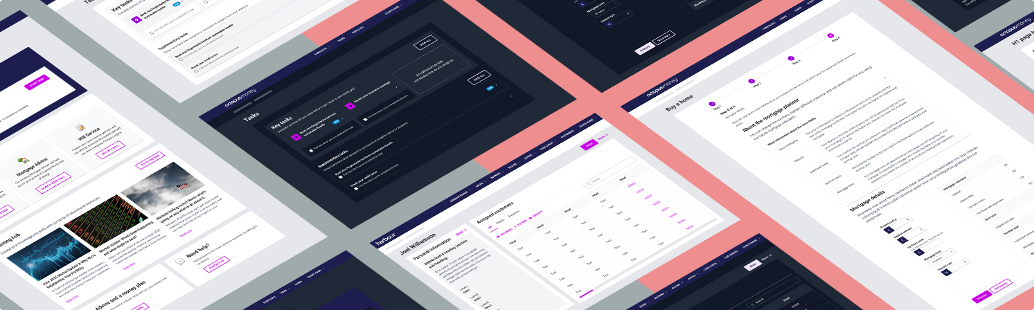
 Fimga component library with Octopus Money styling
The problem
The product worked, it just didn't scale: the screens had been built in isolation, typography and layouts were inconsistent, accessibility wasn't systemised, and the MUI components were heavily customised in code. What looked functional on the surface masked structural problems underneath.
As the company transitioned from startup to SaaS, that drift became risk. The Engineers were customising instead of composing, patterns weren't reusable, and accessibility relied on memory rather than enforcement. In a regulated fintech environment, inconsistency isn't cosmetic, it's operational and compliance risk.
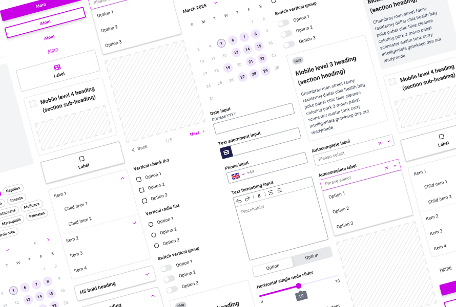
 Variable modes within Figma contain the design system specifics for each brand.
What I did
Variable modes within Figma contain the design system specifics for each brand.
What I did
I started by formalising the visual and structural foundations in Figma: making accessible colour palettes, type scales, spacing rules, layout standards etc. It created immediate alignment, but it was clear that first system was built for a single product at a single moment in time.
As the company expanded into SaaS (white-labelling and multiple products) we evolved the design system into a semantic, token-based architecture aligned across Figma, code and Storybook. We reduced unnecessary flexibility in MUI, simplified custom logic, and embedded accessibility directly into components rather than retrofitting it later.
Close collaboration with engineering was what made it real. The system stopped being a design layer and became shared infrastructure.
The focus shifted from expressive flexibility to scalable stability.
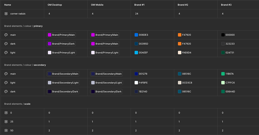
 Three-tiered semantic token architecture
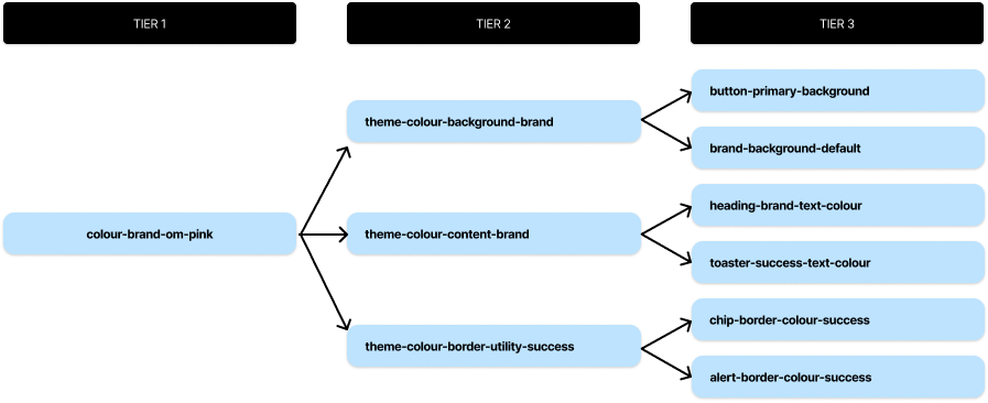 Illustrating how a brand primitive value (pink) flows from Tier 1 through semantic theme tokens in Tier 2, and resolves into component and pattern-level tokens in Tier 3,
What shipped
Illustrating how a brand primitive value (pink) flows from Tier 1 through semantic theme tokens in Tier 2, and resolves into component and pattern-level tokens in Tier 3,
What shipped
A multi-product, token-driven design system that functioned as infrastructure, not interface.
Accessibility became baked into components, reducing risk across the platform. Engineering throughput improved as shared components replaced repeated customisation. QA cycles shortened and deviations from design dropped significantly.
In a regulated environment, the system standardised financial data presentation, disclosure patterns and error handling, making compliance more predictable and cutting late-stage rework.
The more lasting change was cultural as design and engineering now co-owned the structure. Accessibility became a shared language, and new features grew from established patterns instead of being reinvented from scratch. What started as a UI clean-up became the foundation the platform scaled on.
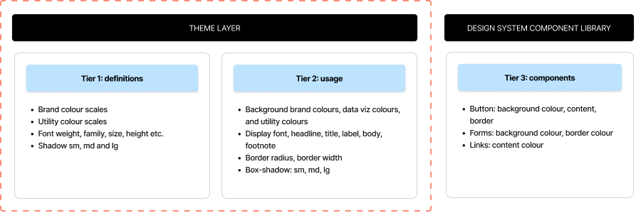
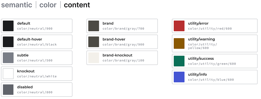 Figma documentation detailing the token specifications and properties for each theme within the design system.
What I'd do differently
The limitation of the first system is obvious in hindsight: it was designed for where the product was, not where it was going. Building with future flexibility in mind from the start would have reduced the cost of the second evolution.
What held both phases together was the same thing: agreeing principles early and staying close to engineering throughout. When timelines compressed or scope expanded, that shared foundation kept the work grounded.
A design system is only as good as the team that maintains it. Getting that ownership distributed early matters more than getting the tokens perfect.